Boots App Redesign
This was not done by the official Boots team, it is just a concept that I made up to try out what I learned at the Interaction Design Foundation.

Roles and Responsibilities
I was responsible to conduct user interviews, business and competitive research, online surveys and visual design.
What is the Boots App?
This project is a redesign of the Boots app based on a home assignment from the Interaction Design Foundation, with the intent of improving the shopping experience.
The Problem
The newest version of the app seems to have made it even more difficult for users to navigate to key areas like Login, User Account and Favourites.
Timeline
December 2018 - February 2019
Tools
• Sketch
• Photoshop
• Quant-UX
• Principle
Introduction
Please note that my research and survey took place in 2018, which means that the app could be in a newer version by now.
Boots is one of the largest chains of the segment in the UK and Ireland counting with around 2,485* stores, 618* Boots Opticians practices, and 503* Boots Hearing care locations.
The company could be combining their huge amount of stores with many online services to boost their sales through their app but unfortunately, it is losing the affection of its users due to various issues.
Research
I started my research by looking at some user reviews at the app store and google play. I found out that a lot of users was having the same problems like myself with the current app.
The newest version of the app seems to have made it even more difficult for users to navigate to key areas like Login, Account and Favourites for example.
User Interviews
I interviewed a group of 7 people aged 19–46, users from the current app to find out what are their expectations when they shop online for products within the same category (beauty and pharmacy).
Key Findings
1. Most people rather shop online because is more accessible and it can be done on the go.
2. Filters are essential to make the shopping experience easier and faster.
3. Users make good usage of stored data like payment and address details.
4. Small features like quick buy, personalised offers and suggestions are a plus.
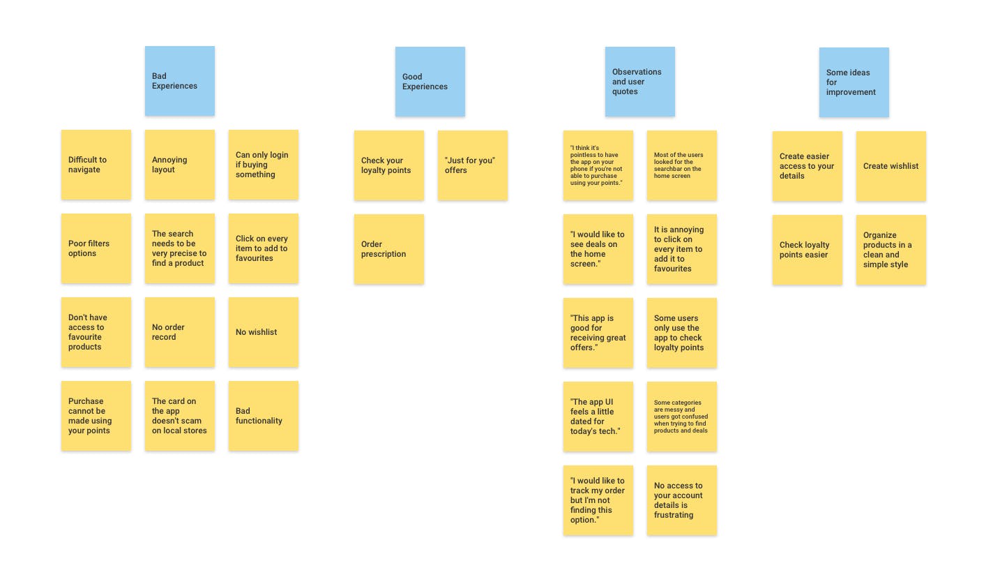
Pain Points
1. You can only log into your account at the checkout.
2. You can’t add things to favourites without clicking on every item.
3. Very difficult to navigate and find what you want.
4. You can add items in favourites but the app doesn't give an option to access it.
5. You cannot pay with your points using the store's card through the app.
6. You need to always carry the loyalty card to collect points at the store.
"Every new update just makes the app worse! You can no longer log into your account only at check out, you can't filter or search for things as well as other apps. Boots really needs to do a lot of work to make this as good."
"Worst app ever, can't even load basket. You can't add things to favourites without clicking on every item. Waste of time."
"Very difficult to navigate and find what you want. They were much better before. On the positive side, great to update offers to get extra points. "
"I can't seem to find the list of my favourite products after adding them all which is a shame as it would make shopping a lot faster. "
"Considering what a big retailer Boots is this app is terrible! It's really hard to browse because of the poor filter options."
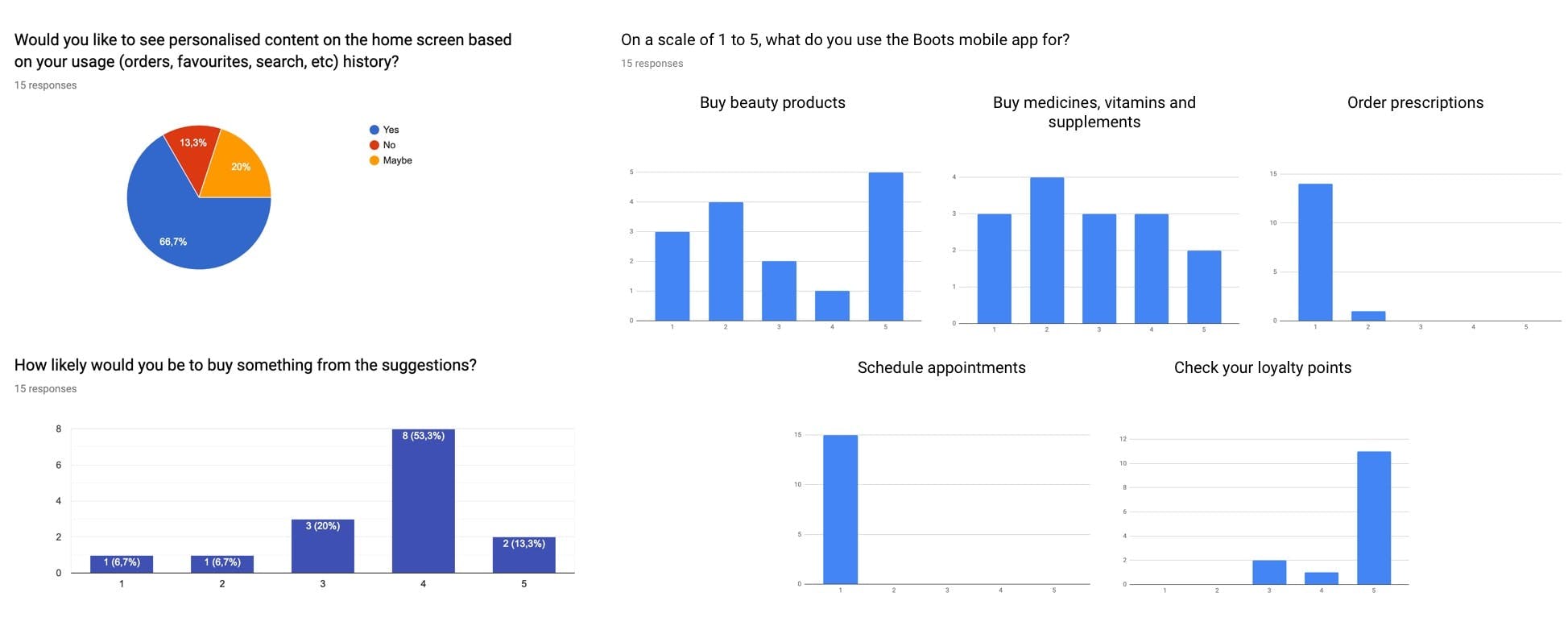
Online Survey
I conducted a survey because I wanted to empathise more with the users of the app. I wanted to understand their motivations of using the app, which makes them chose this product, identify problems, outline functionally difficulties, etc.
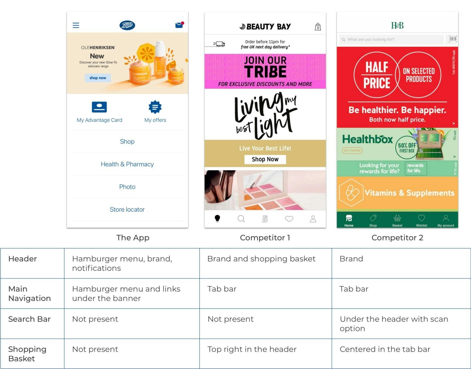
Competitive Analysis
I searched for some similar apps from other brands with the same categories of products (pharmacy and/or beauty) to analyse UX, UI, User flow etc, which I'm not going to detail everything in here hence I wanted to focus on the Boots app issues but I'll leave here one example of the analysis of the home screen.
How Might We?
I used "How Might We" questions to open the brainstorm session, it allowed me to explore helpful ideas to solve the design challenges.
• How might we improve the shopping process?
• How might we implement new payment methods?
• How might we keep the users' loyalty to the app?
Affinity Mapping
User personas & journey maps
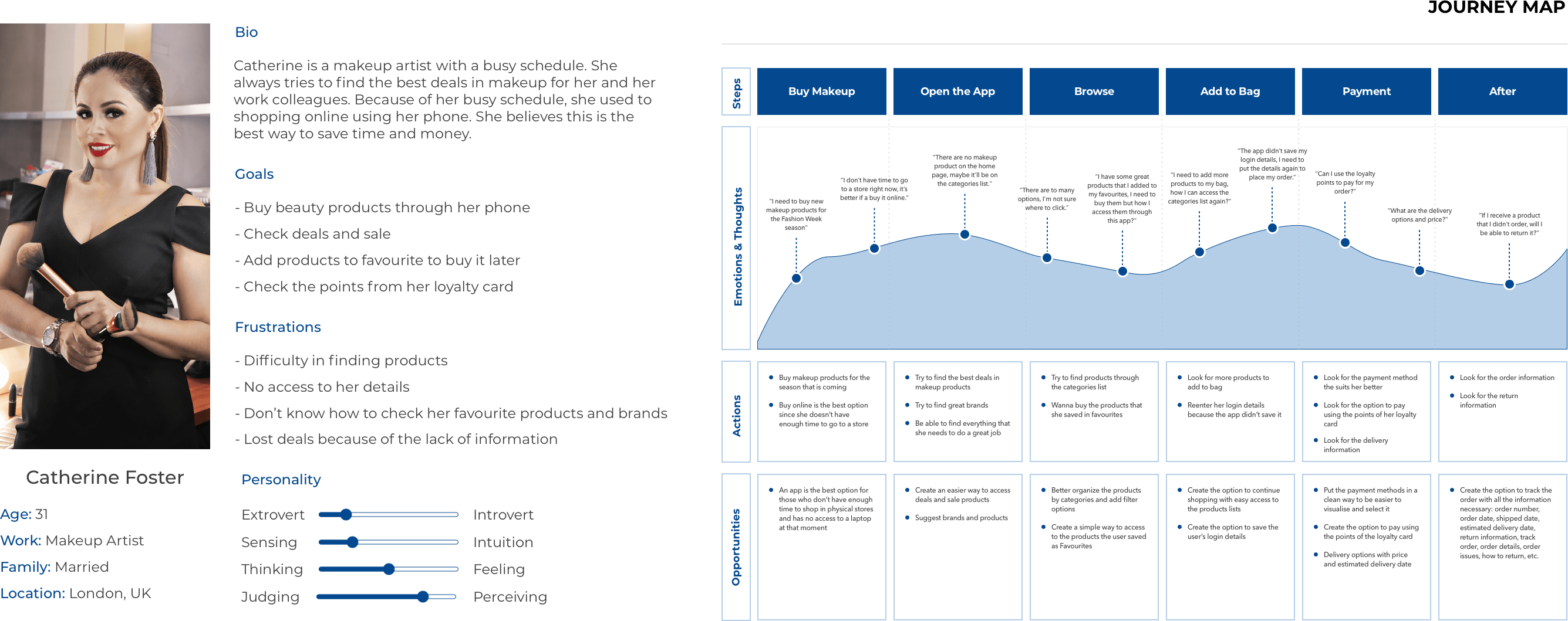
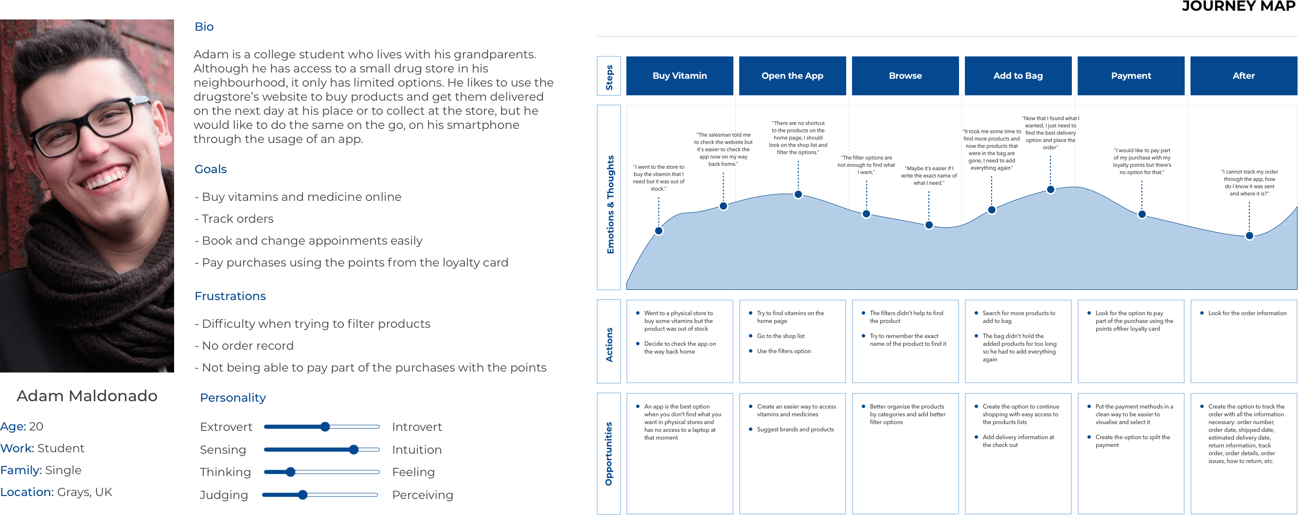
From all the analysis above, I identified two main user personas and then I defined their experiences with customer journey maps.
1- Catherine Foster
2- Adam Maldonado
Storyboard
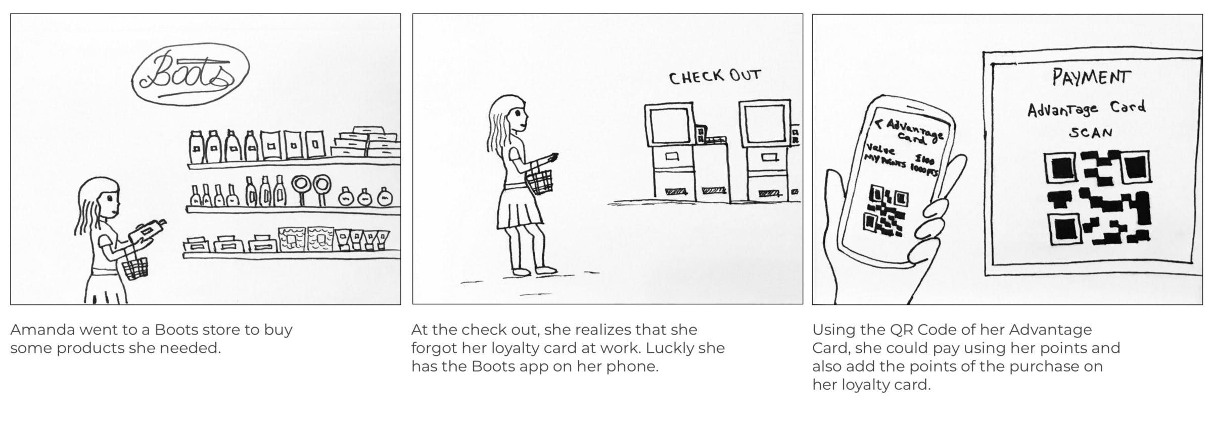
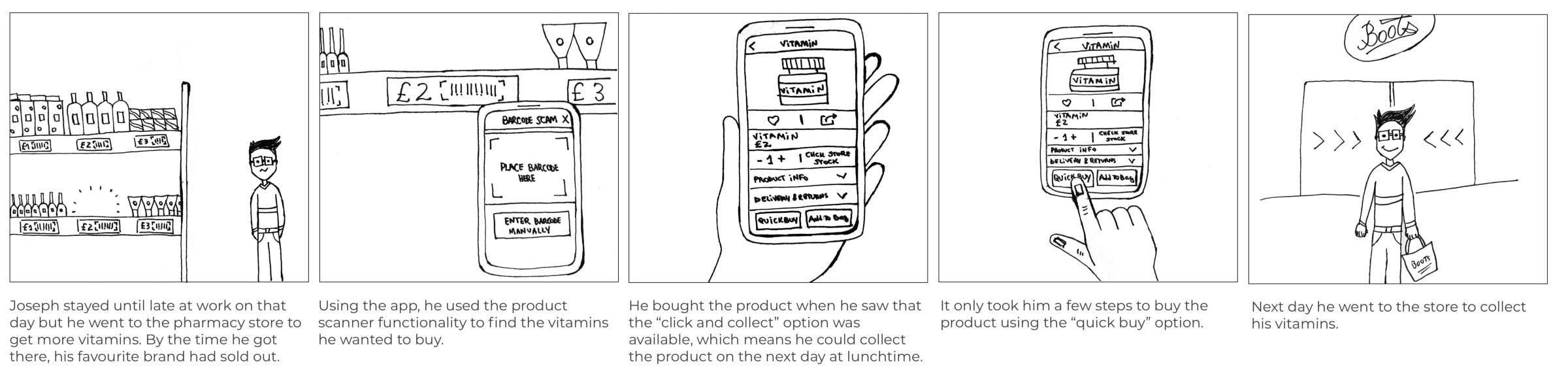
I made visual storyboards to study how people would enjoy the new features I’m introducing in this app.
1- Loyalty card scan code
2- Barcode product finder
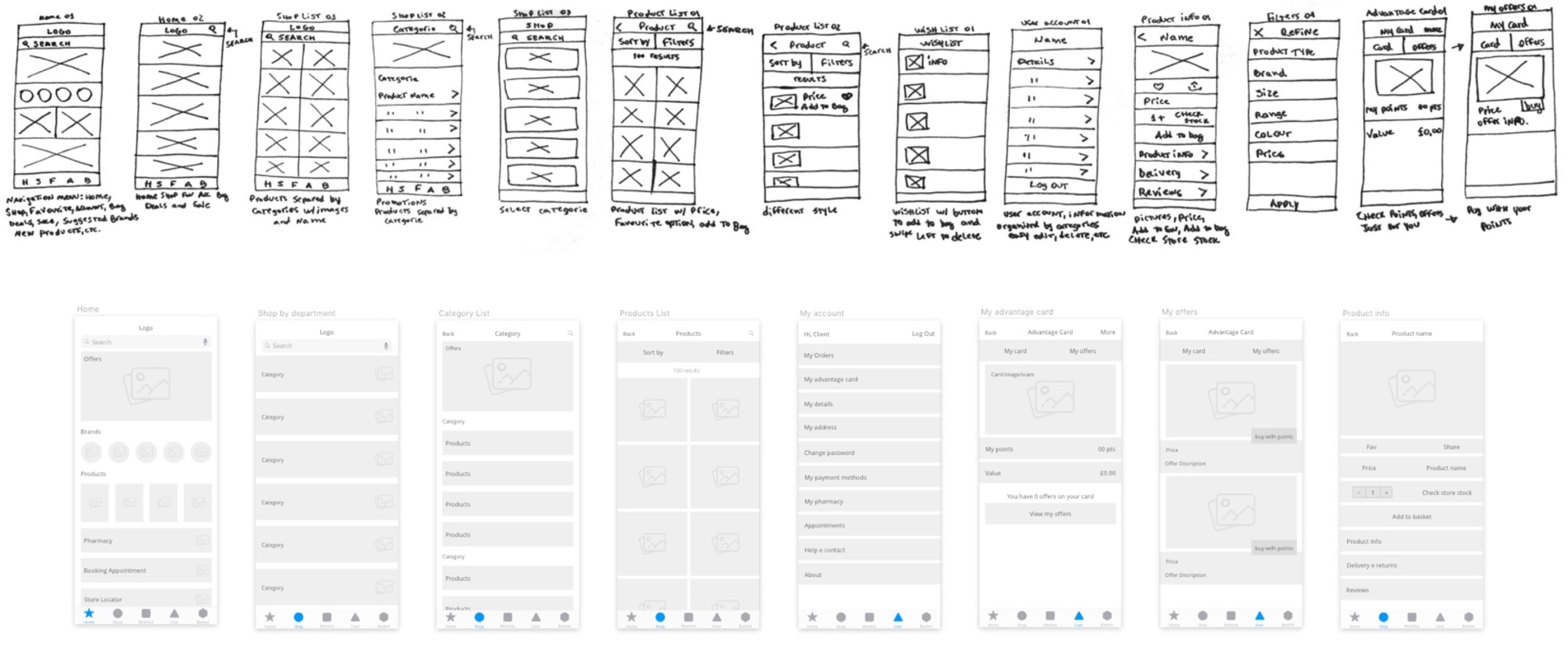
Sketches & Wireframes
I started to transform my ideas into sketches. With the sketches ready, I did the wireframes to build a prototype, the next step was to manage the first usability test.
Usability Testing
I used the Quant-UX platform to conduct my tests. It has features like screen recording, heat maps, user journeys and many more.
I gave the users, 5 tasks to complete on the current app and on the redesign.
Suggested Solutions
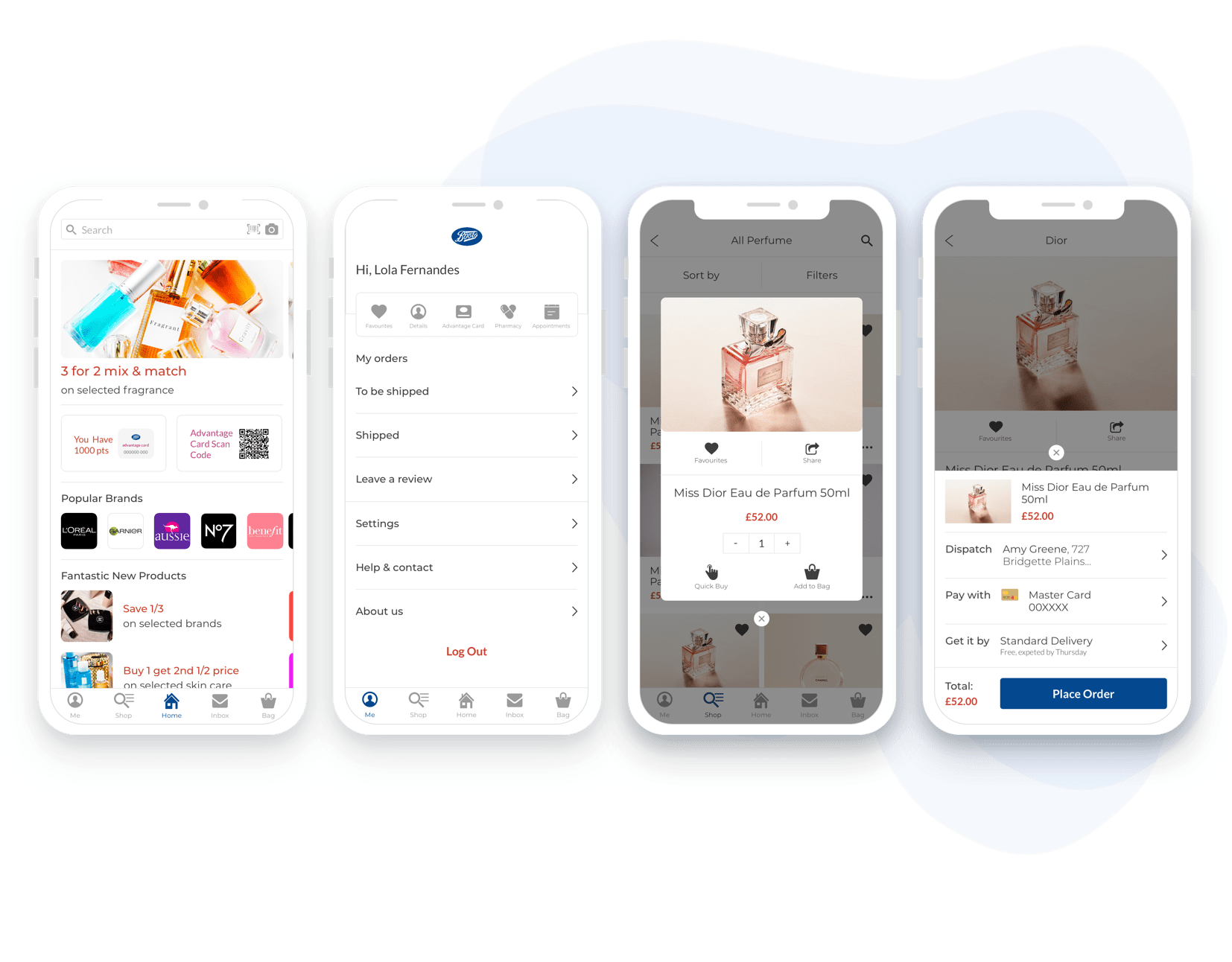
1. Main Navigation / Tab bar
I introduced a “Tab Bar” at the bottom of the app. Here I added quick options to give the user the freedom to navigate between the main screens of the app instead of having to go back to the home screen to access them. I moved the “Inbox” button here since many users only use the app to check their promotions and notifications.
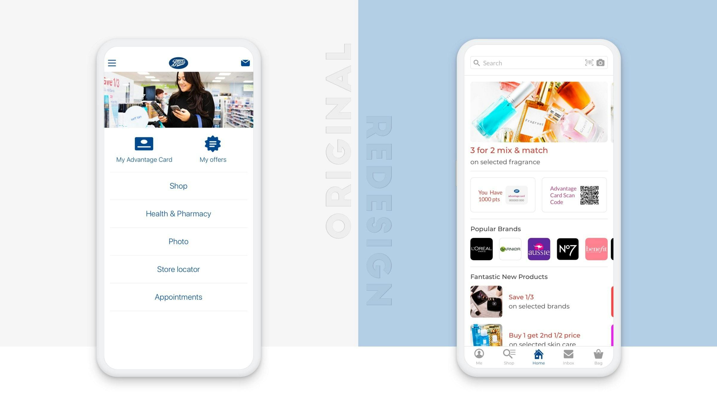
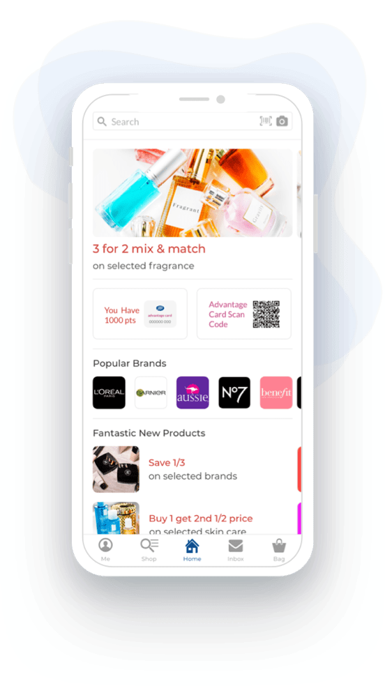
2. Home Screen
• Added a search that contains options to find products by barcode if the user is in store.
• Added the advantage card amount of points.
• Added a QR Code scanner for the user’s advantage card. With this change, the user doesn’t need their advantage card with them.
• Added promotions, popular brands and new products based on the user’s usage of the app (the surveys validated this idea).
3. Shop by departments and categories
Many users got frustrated because they had to click too many times to find what they were looking for due to the number of nested categories.
In my redesign, I merged some categories to reduce the number of items per list and I added the "all products" option at the top of each list. Now the users can jump to the product list straight away, they can sort or filter the results at that point if they wish.
4. Product list
Users found annoying to favourite items since they had to open each product to do it. I solved this issue by adding a favourite button on all the products at the Product List screen.
I added the ”Quick by” feature on this page to improve the user’s experience which allowed them to buy products with fewer clicks if they already have Payment Methods and Delivery Address saved.

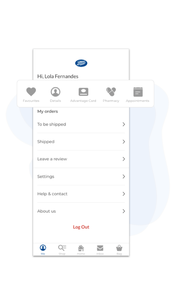
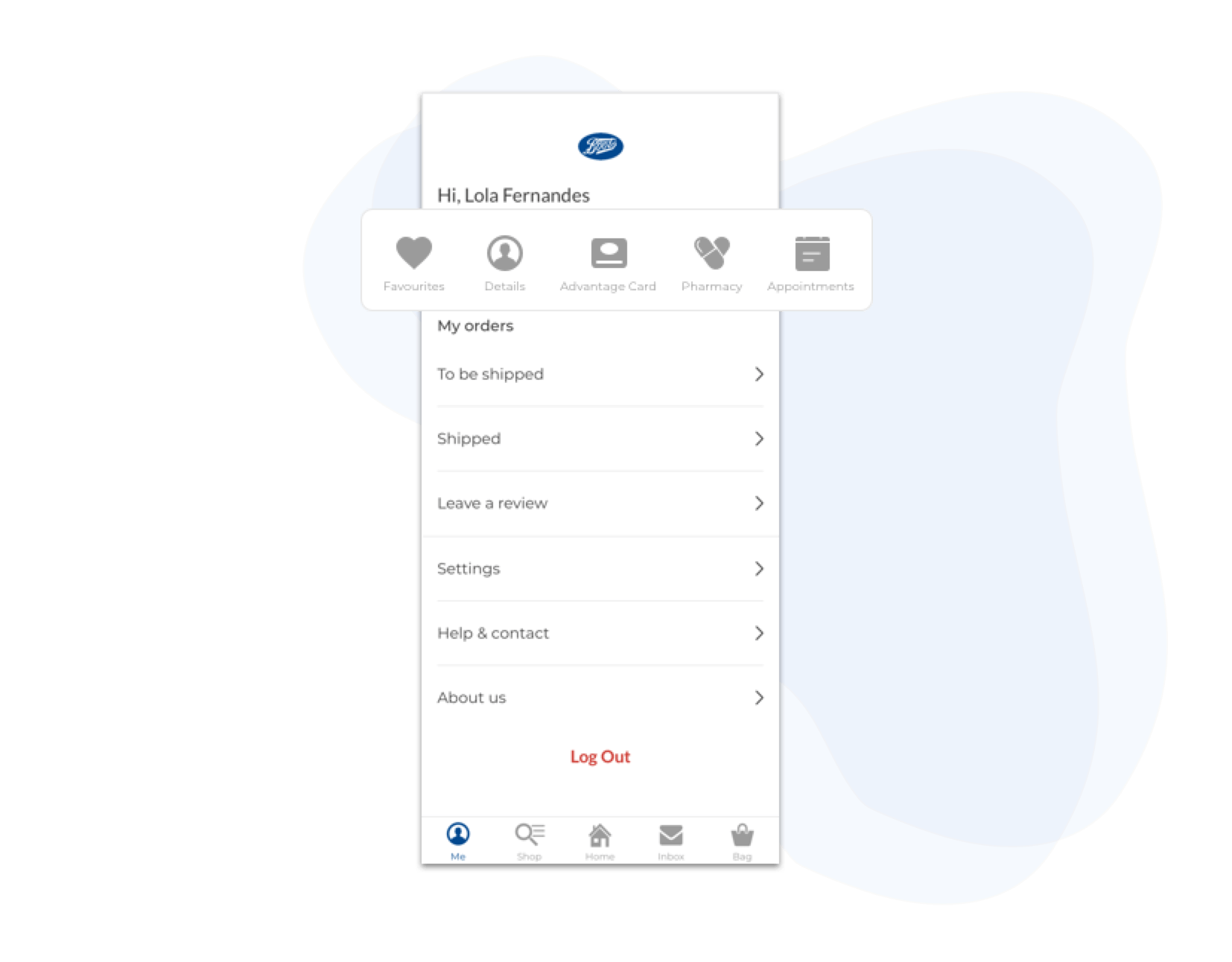
5. User account
The User Account screen got many users, including myself, unsatisfied with it. Users can not access core options like login into your account, favourites list and order history for example.
Imagine being able to favourite products but not be able to access them later on. You can only log into your account by going all the way till the checkout screen.
With my redesign, users can access their accounts through the Tab Bar and find in there all those missing pieces mentioned above.
Conclusion
This redesign was made by me to practice what I’ve been learning from the Interaction Design Foundation. I’m not affiliated with Boots so of course, I don’t have all the data their team have. I based the research on my personal experience and some data that I could find by interviewing existing users of the current app and reading reviews.
During the research, I found that users were confused and frustrated while shopping through the app because it is difficult to navigate and find products and some key areas like Login, Account and Favourites was removed or the user doesn't know how to access it.
The biggest design challenge was to find a way to make a better experience for the users and make their shopping journey enjoyable. I overcame this by pinpointing pain points, through affinity mapping, personas, journey maps and storyboard.
Next steps: conduct more usability tests to validate the suggested solutions.
Wanna see more?
Where's my pet?
This case study documents my first UX/UI design process for creating a mobile app that helps users find their lost pet.
Designing a guided AI document creation flow
A guided, AI-powered drafting experience that replaces uncertainty with clarity - improving activation, trust, and retention.