Where's my pet?
This case study documents my first UX/UI design process for creating a mobile app that helps users find their lost pet.
Roles & Responsibilities
I took part in all phases of the design process to create this app from scratch.
What is Where's My Pet?
The concept of this app is to reunite owners with their beloved pets. You also get to help homeless pets to have an opportunity to find a family.
The Problem
Lots of pets get lost every day and some of them sometimes don't find their way back home.
Timeline
November 2018 - January 2019
Tools
- • Sketch
- • Photoshop
- • InVision
Introduction
I have an emotional connection with this app because last year while I was on holiday, my dog Lola ran away from the dog sitter as she was walking her in the park.
Luckily, Lola had my phone number on her collar and a good person found her and called me not too long after.
In between, you can only imagine my stress and fear I would never see my sweet Lola again.
The good feeling of relief that came after, showed me how rewarding this experience was and gave me the idea to create something that could help other people in a similar situation.
Research
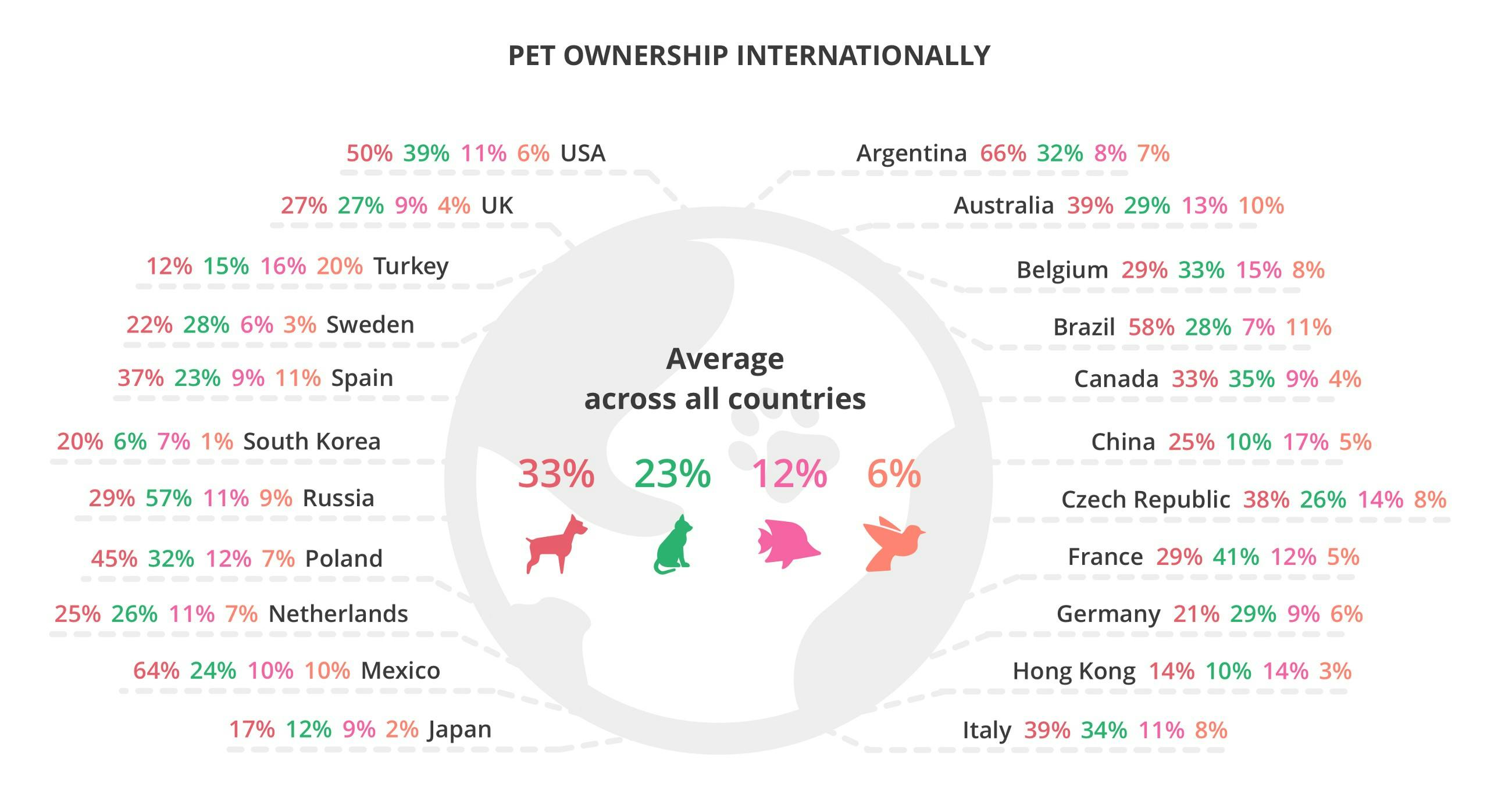
Market
Even though the pet population has declined from 71 million to around 51 million over the past years, it is still a huge amount. According to PFMA, around 45% of households in the UK have pets.
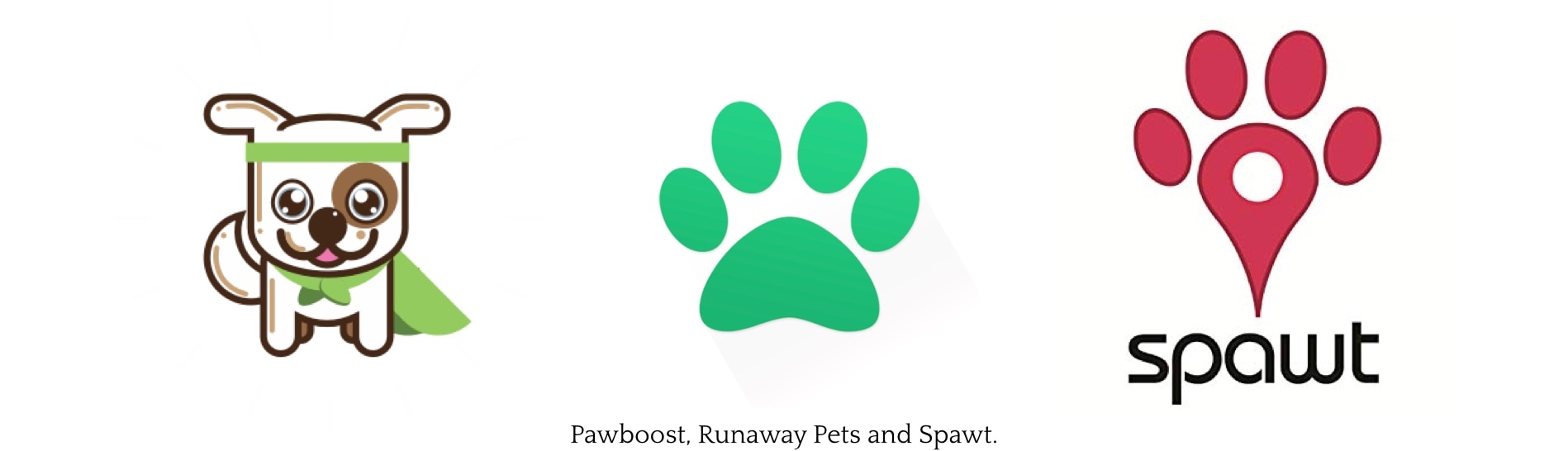
Industry
I looked at some of the current tools available to learn how they are currently helping pets.
User Interviews
Interviewing real-life users was essential to analyse different points of view. At this stage of the process, I wanted to find out what would make a pet owner seek this kind of product and what would be their initial expectations.
What I found during the interviews:
• Pet’s should be listed in a clear matter to avoid confusion.
• A chat could avoid unnecessary meetings.
• Some users may want to add more pictures of the pet to make it easier to identify it.
• Information is never too much.
• Filter the area of results could be helpful.
Pain Points
Based on the user research I identified the following pain points:
1. Lost and found pets on the same list create confusion.
2. Difficulty to delete the pet or edit its information.
3. Some users may want to add more pictures of the pet to make it easier to identify it.
4. Notifications of the whole city instead of the user’s area can be annoying.
“My pet went missing last weekend and came back a day later, and he’s still listed in the Lost Pets section (because I do not know how to edit any of his info or even delete his listing).”
“It’s not real-time and the tab for found dogs brings up a mixture of lost and found dogs. Needs work.”
“Alerts should only be about pets near me and not all over the metro area.”
“It’s really irritating you can only post one picture if your dog has multiple spots you can’t show that in one pic. You guys should let us add more photos.”
Extra findings
During my research I found that not all the lost pets go back to their homes, some of them either goes to shelters or back to the streets. Thinking of these poor pets, I decided to create an adoption area so they can have a better chance to find a home.
Ideation
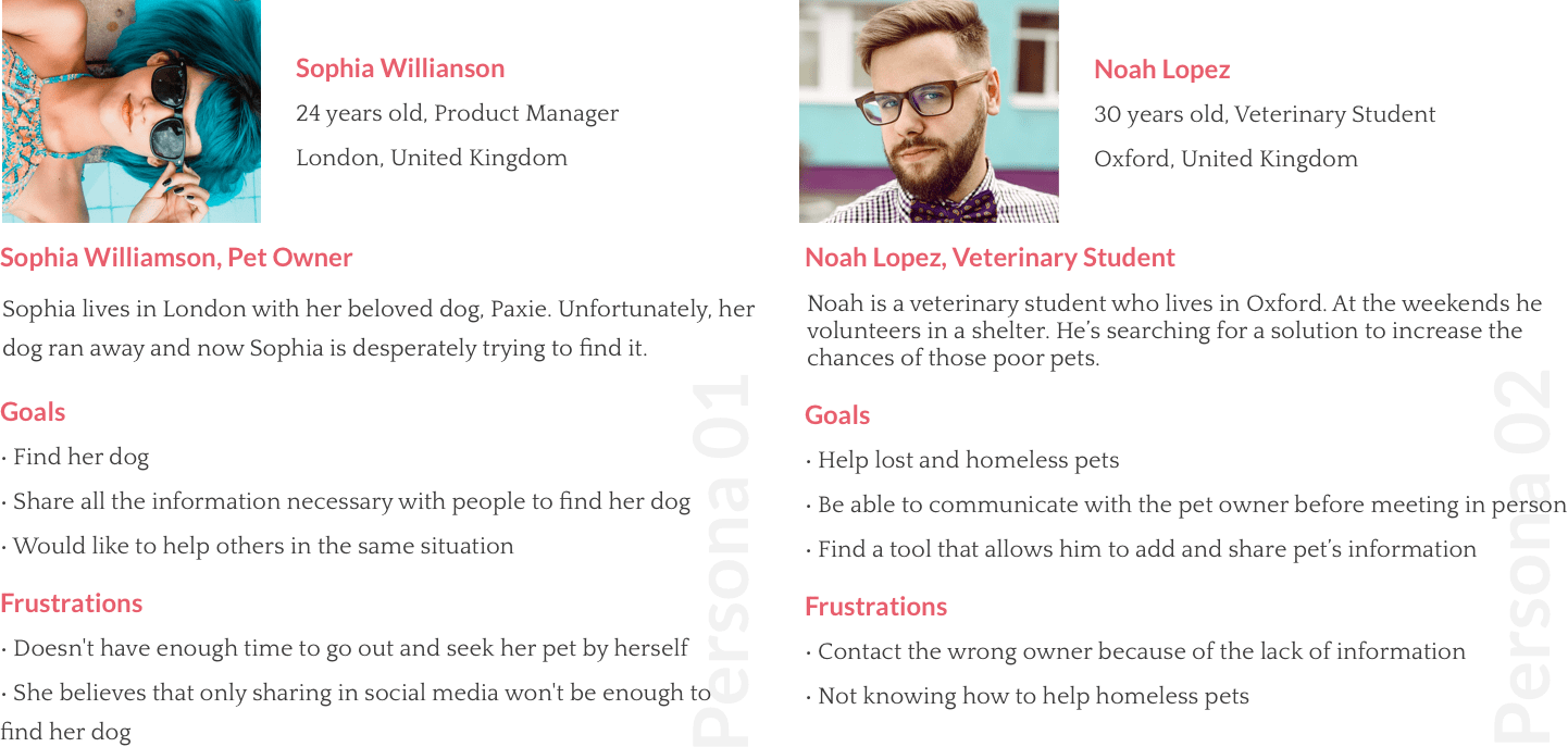
Personas
With all the information I collected on the previous steps, I drafted two personas to help me understand different user needs and expectations.
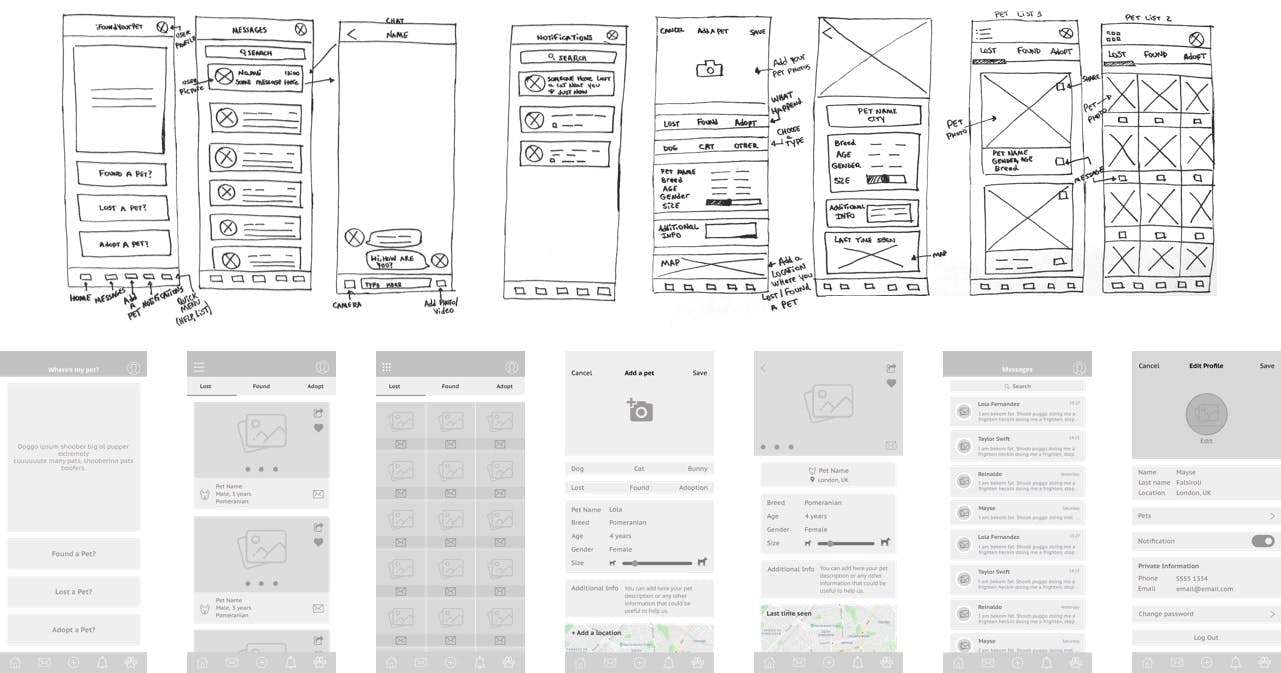
Sketches & Wireframes
This step helped me put all the elements in perspective without worrying about its appearance. I found this method crucial for the development of the app, it was the easier way to test all my ideas.
With the wireframes ready, the next step was to test the app with real-life users.
I will not show all the screens here on the sketches and on the wireframes, but you can see all of them and how I imagine this app would work on this prototype.
New findings & Refinement
After tests, I found out lots of stuff that required improvement and others that were missing. With these findings, I had to rework the navigation map and refine parts of the app and then test it again.
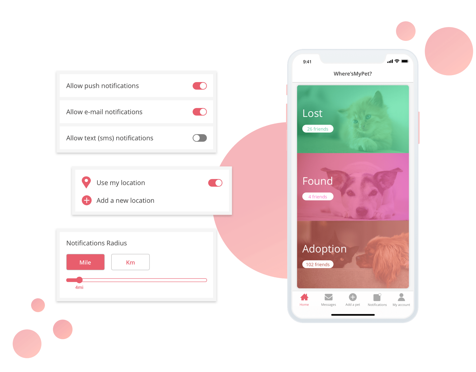
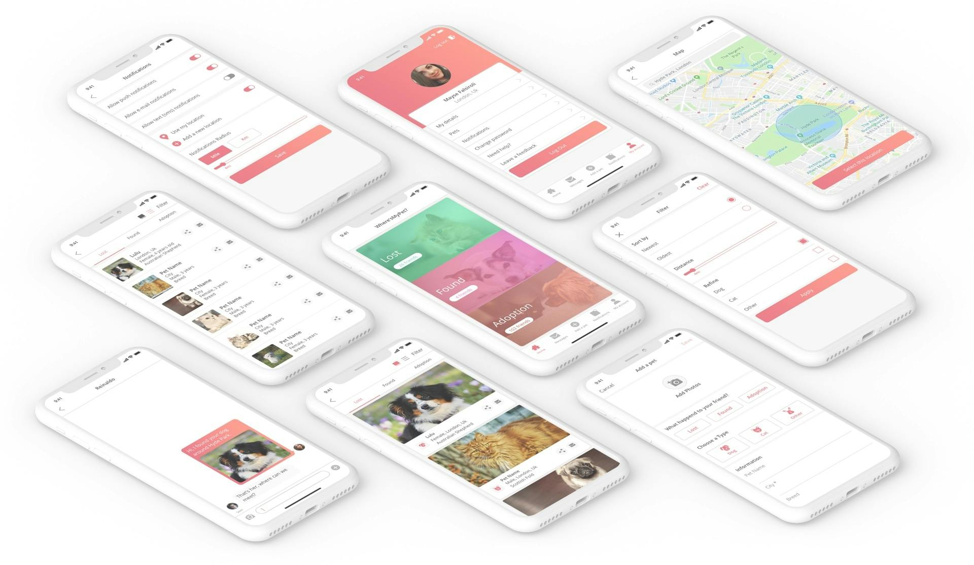
1. Main Navigation
During the first round of tests, I noticed that some users were looking for items like the Logout option and Notifications settings on both items, the Settings menu and in the User’s account menu, so I combined both screens under the User’s account screen to keep all the relevant information in one place. I also moved the user’s account menu to the footer navigation.
On my first version of wireframes, there was a Settings menu placed in the Footer and the Header held the User’s account menu.
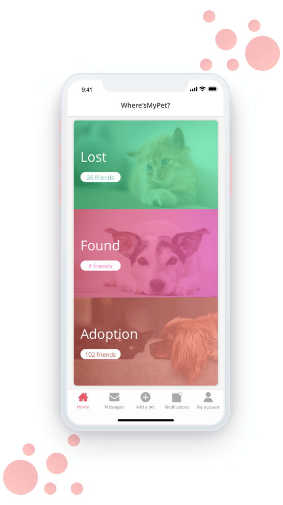
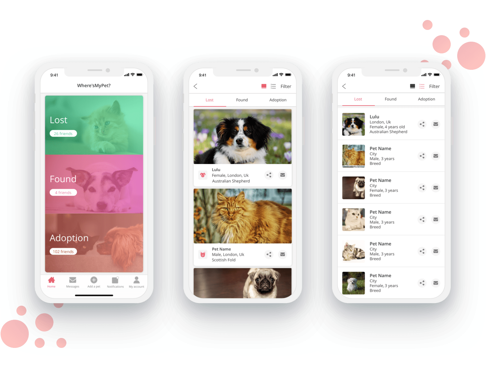
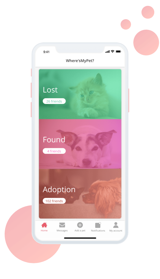
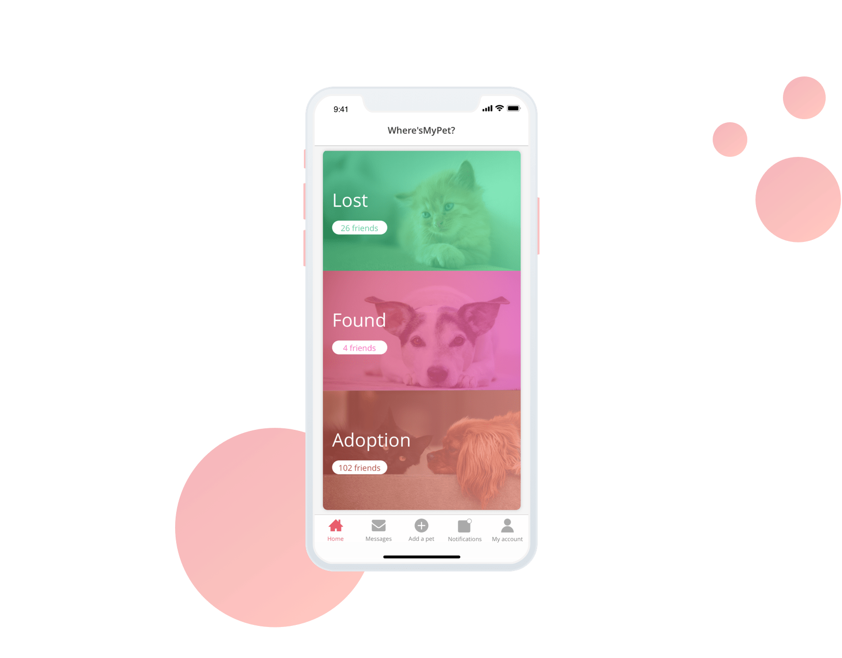
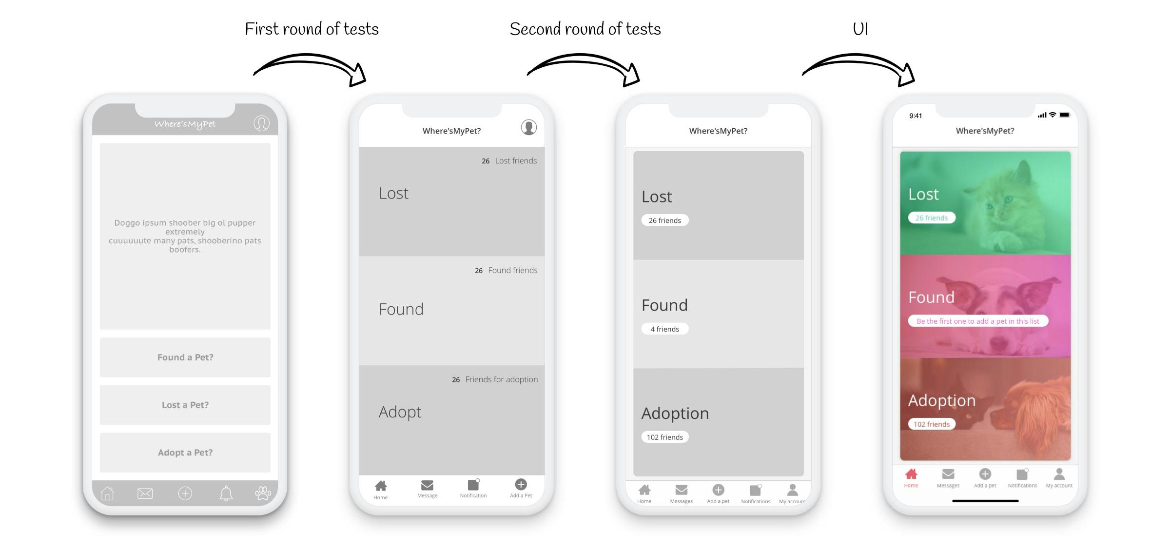
2. Home
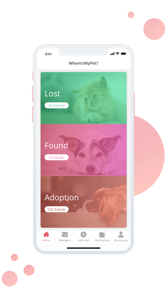
I removed the Hero image as it brought none real value to this screen, which gave me more space to work with the three CTAs in this screen.
I replaced the buttons with clickable sections, each section holds valuable information like the number of pets added to each list or a conditional text “Be the first one to add a pet in this list” in case there are no pets added to a specific list.
3. Add a pet
On this screen, I added a city field and I moved the map to its own screen to minimise the distractions and provide more information while selecting the location.
I created conditions when displaying certain fields as they may not be relevant for every species of pets, for example, when choosing the “Other” option for the pet’s species, a select drop-down will appear with different species to choose from, and some fields may disappear depending on the species, like the “Gender” field for birds (not everyone knows how to check that) for example.

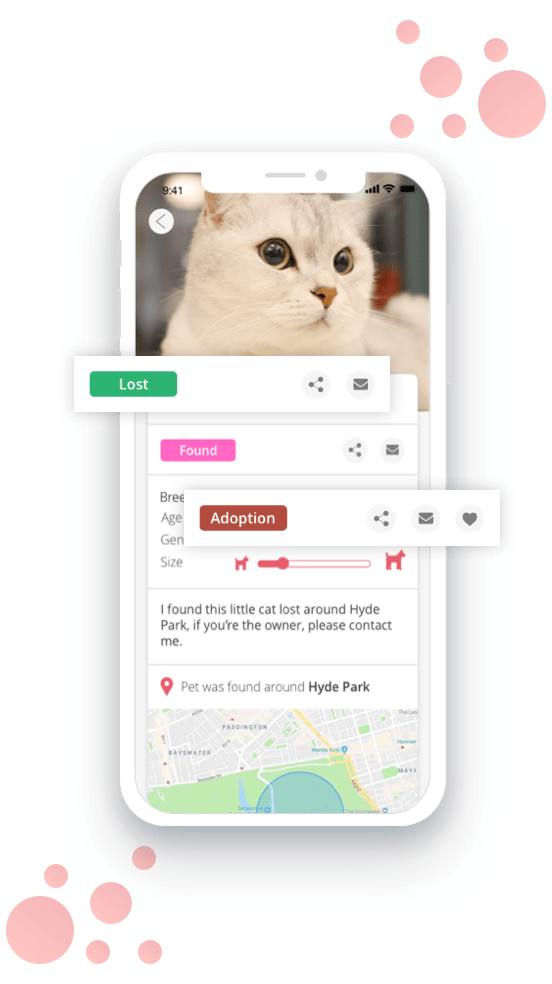
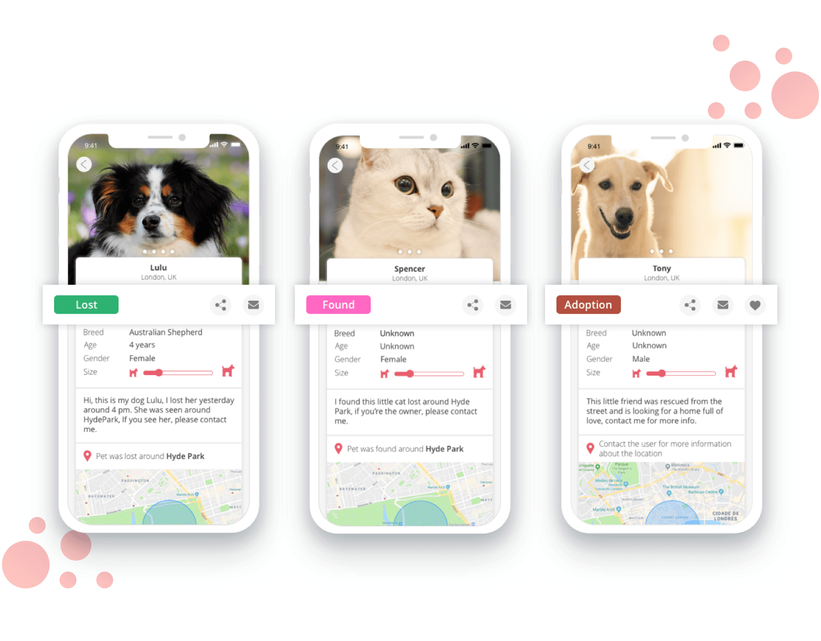
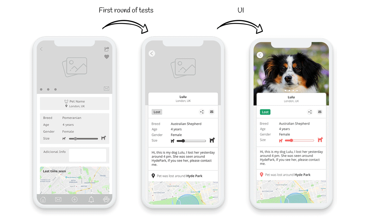
4. Pet profile
I replaced the share and message buttons to keep the pet’s picture clean, free of any kind of distractions, I also create a badge to specify the status of the pet (lost, found or adopt), each badge has the background colour of each list type in the home screen, and finally, I created a dynamic title for the map.
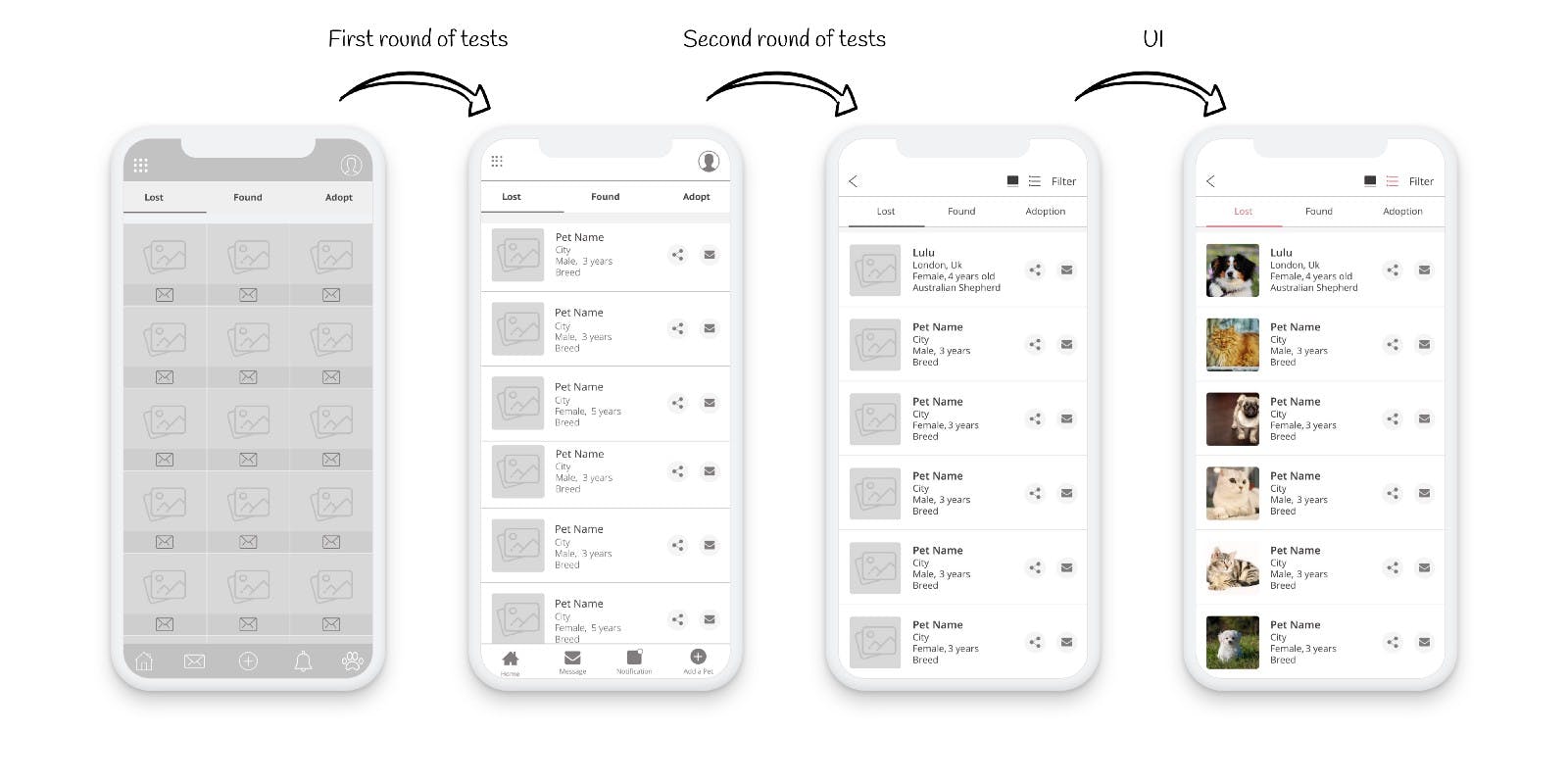
5. Pet list
This second option of the list view wasn’t efficient enough on the first round of tests because it lacked information. It wasn’t engaging enough to click on the pet image to see its information.
I added more information to make it easier to identify the pet, and I added filter options on the Header, giving the user the facility to filter what they want to check first.
Visual Design
To get inspired, I looked at any kind of pet-related apps and websites, learning about the colours, typography and general style.
Typography
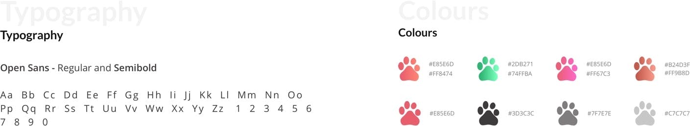
For the typography, I went with Open Sans because it has a clean style and it’s fairly easy to read and work with.
Colours
I wanted to go with warm colours for the theme of the app as they normally transmit passion, joy and playfulness and those are the emotions pets bring to our lives.
I choose green for the lost list because I wanted to give hope to the pet owners that their pet can be found.
For the found list I went with pink because it conveys gratitude, happiness, compassion and love because those pets were found and they are being taken care by someone and hopefully they will be reunited with their owners.
I used a shade of brown for the adoption list because it can mean friendship and it is what you can find in a pet, a loyal friend.
Conclusion
This case study was born from my experience when my baby Lola ran away from the dog sitter. Designing it was a real challenge since it was my first project and I wanted to design something useful that would help not only pet owners but pets as well.
I surely learned a lot going through this whole process but I still have a lot to learn, so please check the final prototype here, and let me know your thoughts.
Wanna see more?
Boots App Redesign
This was not done by the official Boots team, it is just a concept that I made up to try out what I learned at the Interaction Design Foundation.
WellBe
WellBe is a platform focused on providing tailored wellbeing services for employees. This case study documents my experience as a UX/UI Intern.