WellBe
WellBe is a platform focused on providing tailored wellbeing services for employees. This case study documents my experience as a UX/UI Intern.
Roles & Responsibilities
As a UX/UI Intern, I was responsible for creating online surveys and helping to conduct user interviews. I worked on sketches, wireframes, prototypes and the final designs as well as with all UX and UI decisions.
What is WellBe?
WellBe is a broad wellbeing platform for enterprise employees who want to learn more about wellbeing methods to improve their lives
The Problem
Users started to lose interest in the platform due to the confusing navigation, difficulty to find services and outdated UI.
Timeline
May 2020 - Aug 2020
Tools
• Figma
Introduction
WellBe is a startup focussed on helping companies by improving their employee's wellbeing. It accommodates a vast amount of resources and services, however, the navigation is confusing and its design looks outdated compared to the competition.
We decided to recreate the whole platform focusing on the usability and visuals to deliver the best experience possible to our users.
I worked closely with the product owner helping with all decisions regarding the design process, creating the new features while improving the existing ones.
Research
On my first day at WellBe, I meet my team and got access to all the research they already had in place. I learned about the company goals, competitors and main audience with the user research.
The team already had an online survey with a lot of good open-ended questions, unfortunately, the survey was too long and a good amount of users lost their interest in the middle of the survey, resulting in the lack of important information. To make things simple I suggested adding a mix of open-ended questions with multiple-choice questions to try to engage the users and make it easier to complete.
After checking the survey's results, it was still lacking some key points so I created a brand new one to empathise with our users and understand their motivations to keep using our platform, to complement the current research. You can access the survey here.
User Interviews
This was one of the most exciting experiences of the internship, I helped the product owner by taking notes and creating questions when necessary. The user interviews were conducted by phone calls.
Some notes about the user interviews:
• Users would like to have recommendations through the platform.
• Would be great to see wellbeing progress.
• Ideally have wellness resources & services.
• Most of the users would like to learn more about wellbeing.
• Some users would only book a service with a description and good reviews.
Pain Points
1. It’s hard to find time and motivation to keep using wellbeing tools.
2. Some companies don’t offer wellbeing support.
3. Most users have families and would be difficult to attend any wellbeing services outside of work time.
4. Some users tried to use wellbeing tools but didn’t work because of the price.
5. Most wellbeing tools don't have anything different to motivate the users.
“ For me, it would have to be all-encompassing to include nutrition, fitness, time spent reading, time spent meditating etc. prompts throughout the day (similar to headspace), promote a consciousness of wellbeing which will make you more motivated to use it and log progress daily.”
“ My job is very lonely and have nearly no contact or conversations with any adults whilst working 12 hours each day. So something to encourage my social well-being whilst at work would probably make me more motivated.”
“ Maybe a recommendation of activities that have already been paid for my employer. “
“ A tool that you could monitor progress.”
Sketches & Wireframes
With all the data we collect during the research, I shared my ideas to improve the platform with the team using sketches, afterwards I built wireframes and prototypes.
Improvements
The platform focus on 5 wellbeing pillars: emotional, financial, mental, physical and social. The users have the option to take an assessment based on each pillar, which generates a score used to keep track of their wellbeing progress.
Each user has unique necessities and we noticed that our product was failing to better support them by not offering filtered content based on their needs.
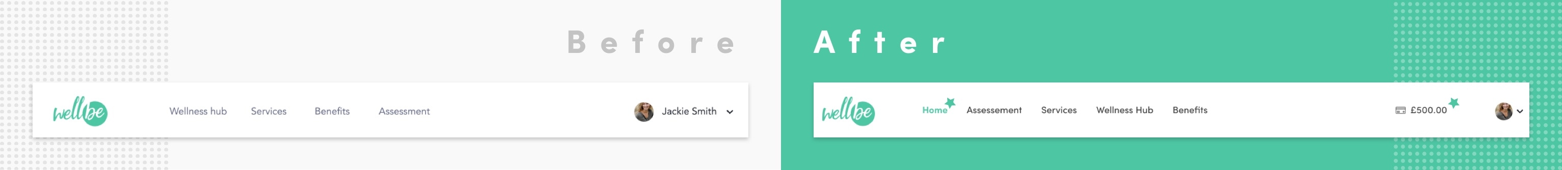
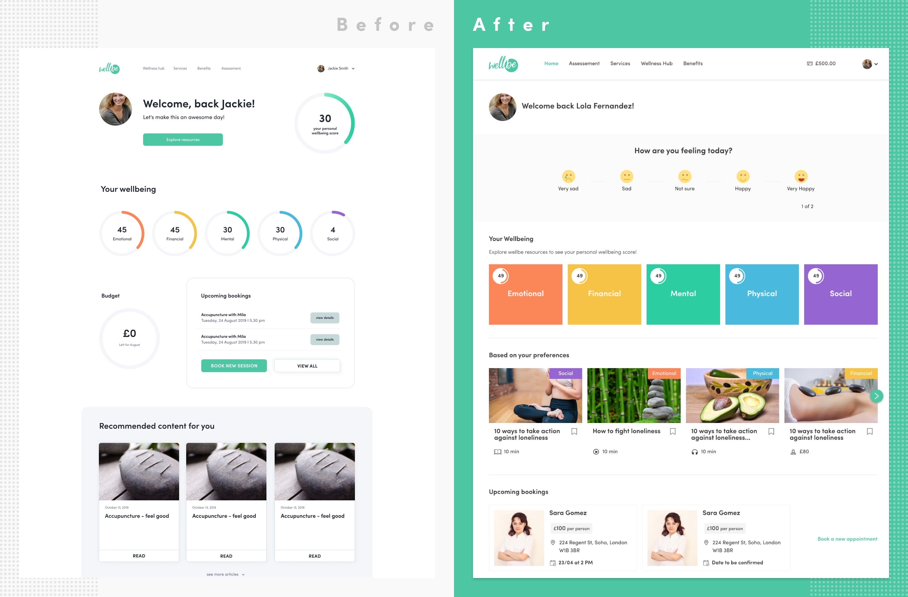
1. Main Navigation
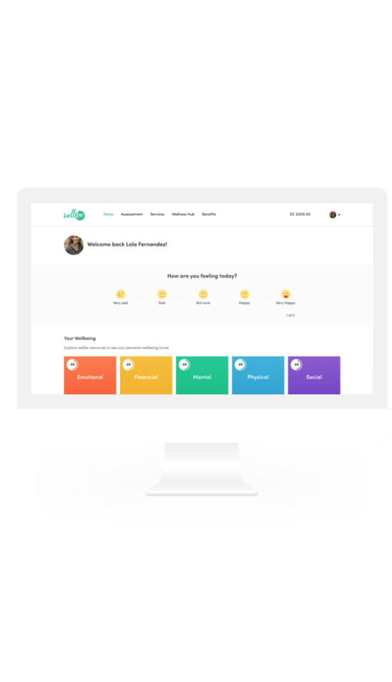
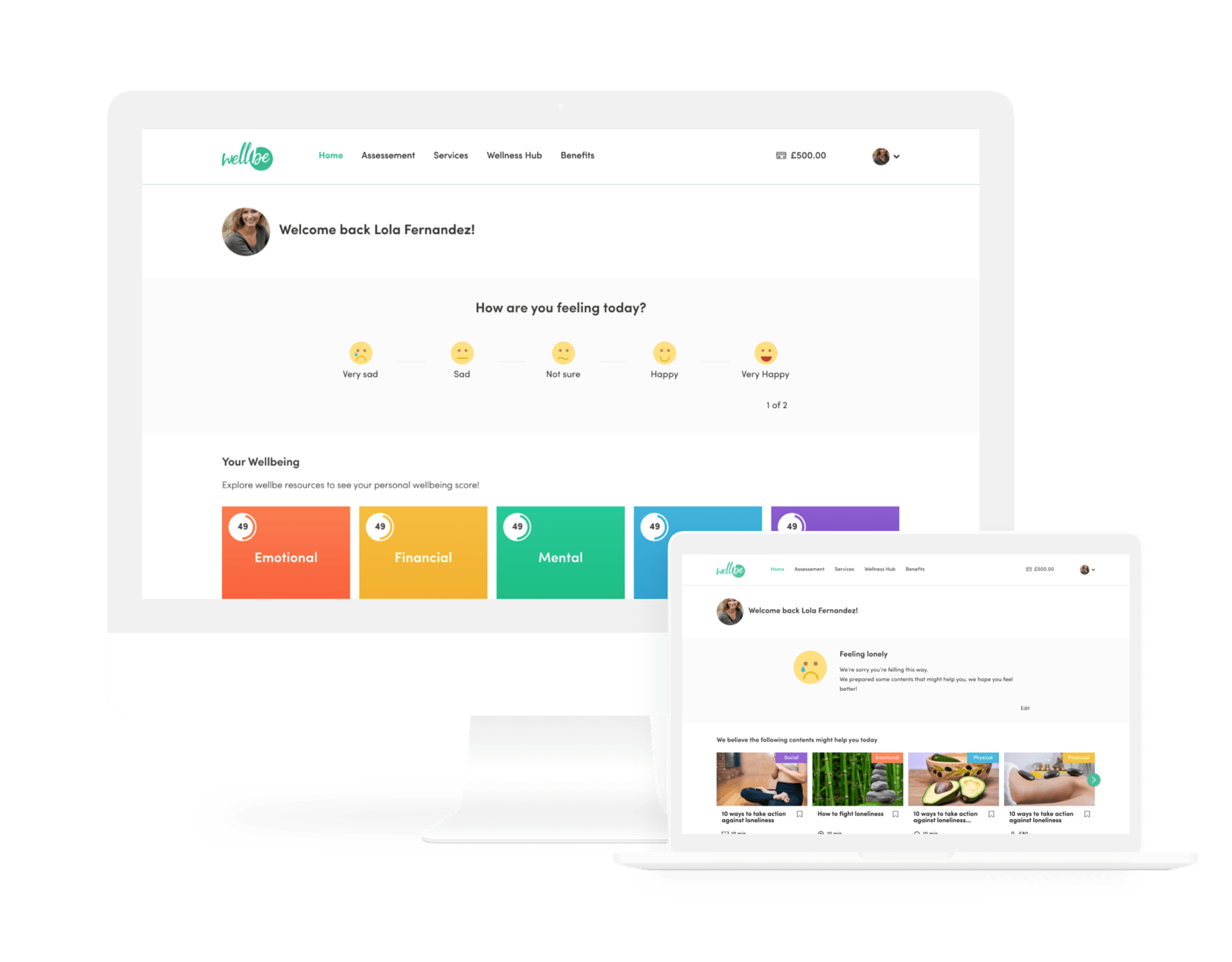
I added two items in the main navigation, the home link and the budget information. Even though the WellBe logo is clickable, some users didn't know how to return to the homepage, which was fixed by adding the "Home" item in the menu and, the budget helps the users keep track of their available funds.
2. Homepage
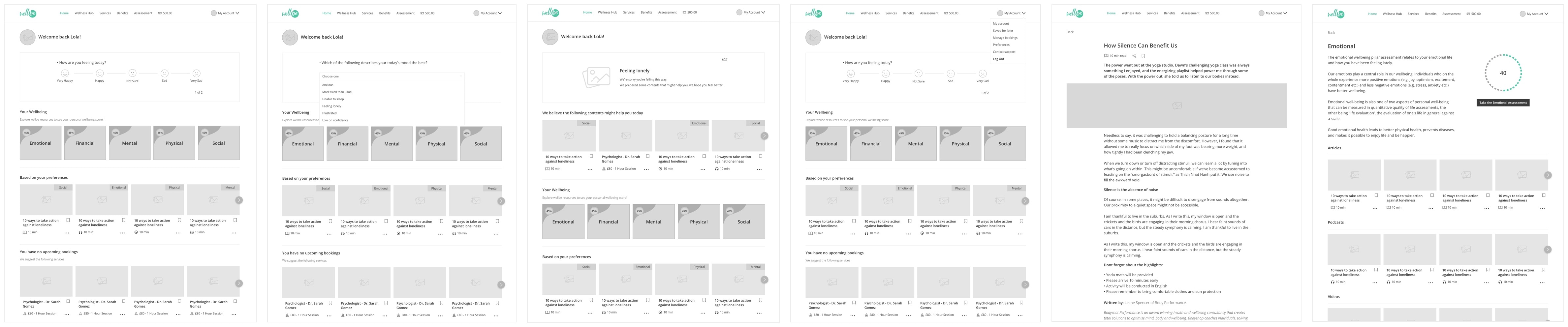
Here I created the "How are you feeling today" section, which consists of two daily questions to check the user's current emotional status. With the information from this section, the platform suggests filtered content that might help them on that specific day.
I decided to create a page for each one of the wellbeing pillars. Each page keeps track of the user's wellbeing score and explains the importance of that pillar.
For each content tile, I created:
• Labels to make it easier to recognise the pillar each item belongs to.
• Icons to distinguish the content type like articles, videos, podcasts and services.
• The average time the user will spend on each activity.
• The favourite button to allow the user to save items for later.
We added a new section for the upcoming bookings, here the user can easily find data like the service type, price, address and date and time. If the user doesn't have any booking shortly, the platform will suggest some services based on their needs.
After usability tests and some minor refinements, our homepage conversion into content consumption increased by 18%.
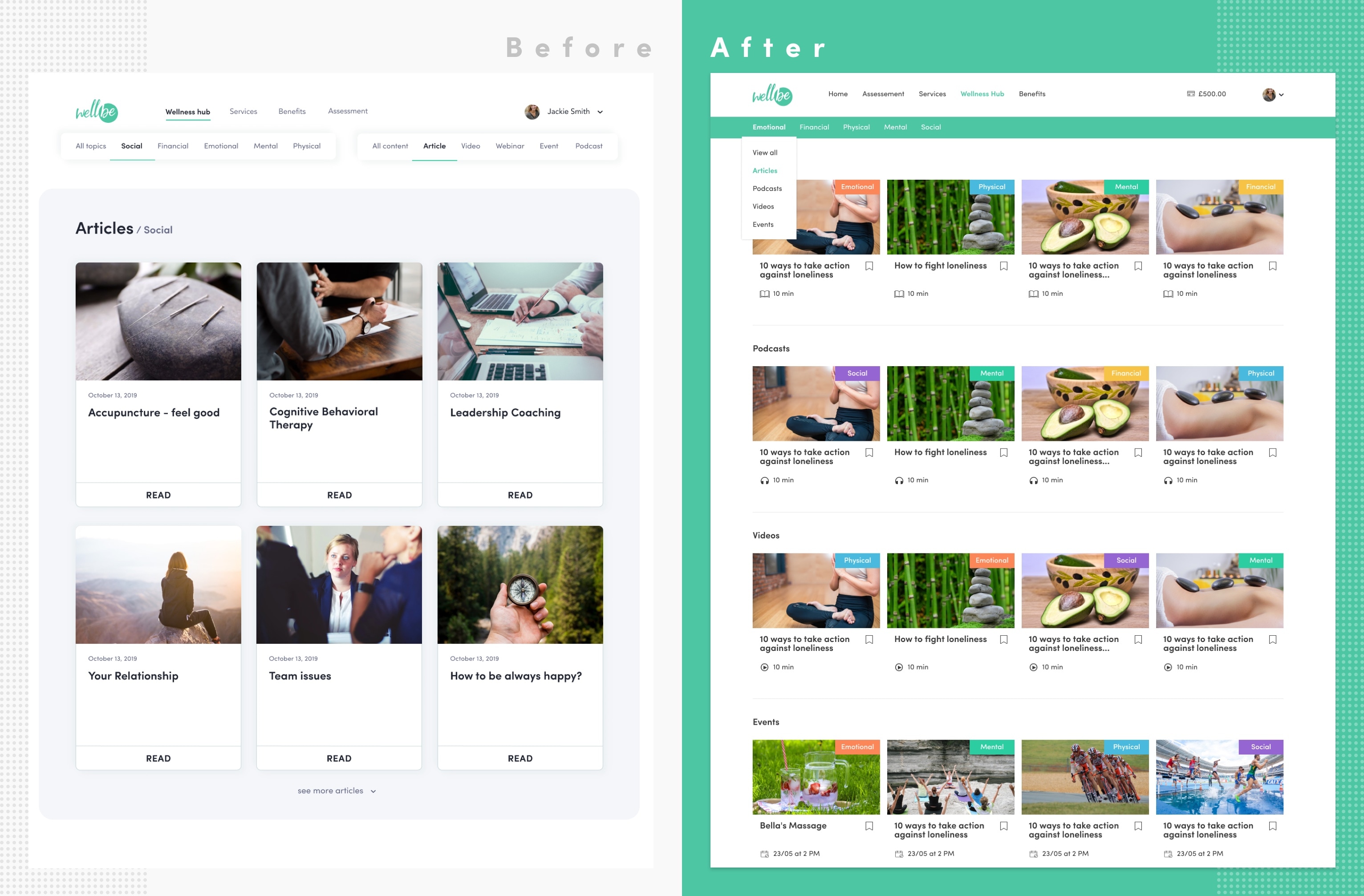
3. Wellness Hub
In the wellness hub page, users are provided with articles, videos, podcasts and events.
The previous design had two menus to filter out the content on this page, unfortunately, some users got frustrated when they had a hard time to find out how to use menus.
Users get confused when they are unable to "piece together" information, to solve this issue, I reorganised the categories and subcategories in a dropdown menu to group together relevant information.
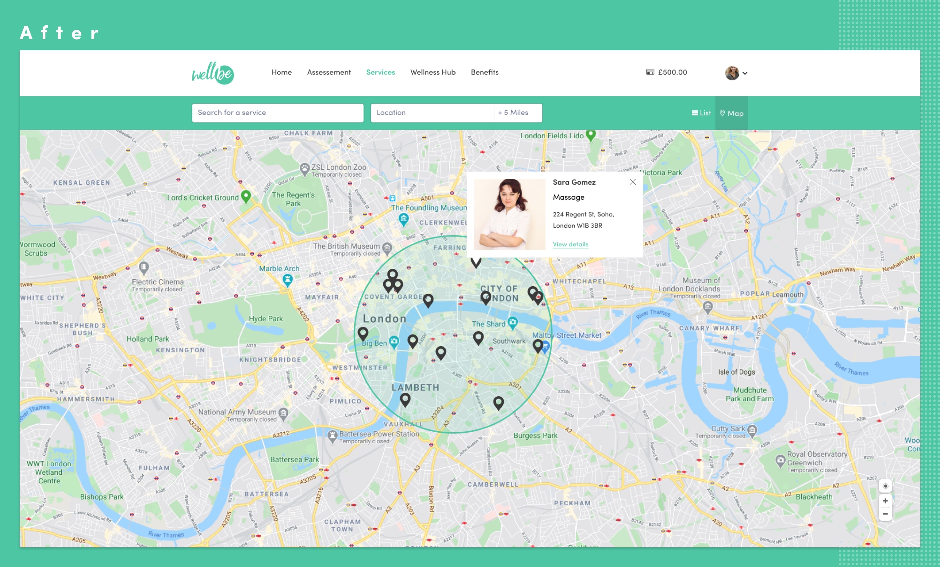
4. Services
Here is where our users used to have the hardest time. To browse for services in our platform, the users just had to click in the "Services" item in the main navigation menu, pretty simple right?
The problem starts after landing on the services page. To find the right service, the users were given two dropdowns selects "Services" and "Recommended for".
After choosing an option from one of the selects, the services page would display one link bellow the dropdowns, from which the user could click to go to another page, read about that kind of service and be presented with a list of service providers. Seems a bit confusing right?
I tried to improve this experience by replacing the dropdowns with a search bar. We created a submenu containing all services and recommended options that appears when the user focuses the new search bar. Now the users have the option to search for what they're looking for or just choose one of the suggestions from the menu.
Next to the search bar, I also added the location input and the miles filter to help users find the nearest service.
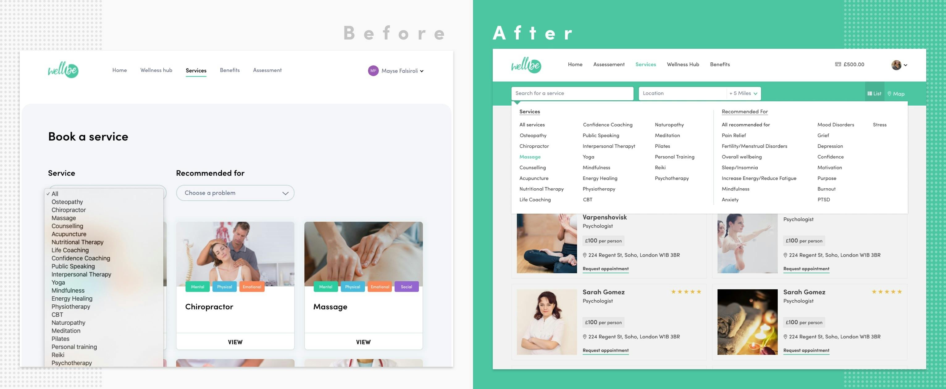
Now the new services page displays the list of services providers right away, each one holding the price, location, rating and the booking option, which means the users don't need to be redirected to a new page.
If the users prefer, they can choose the map view instead of the list view.
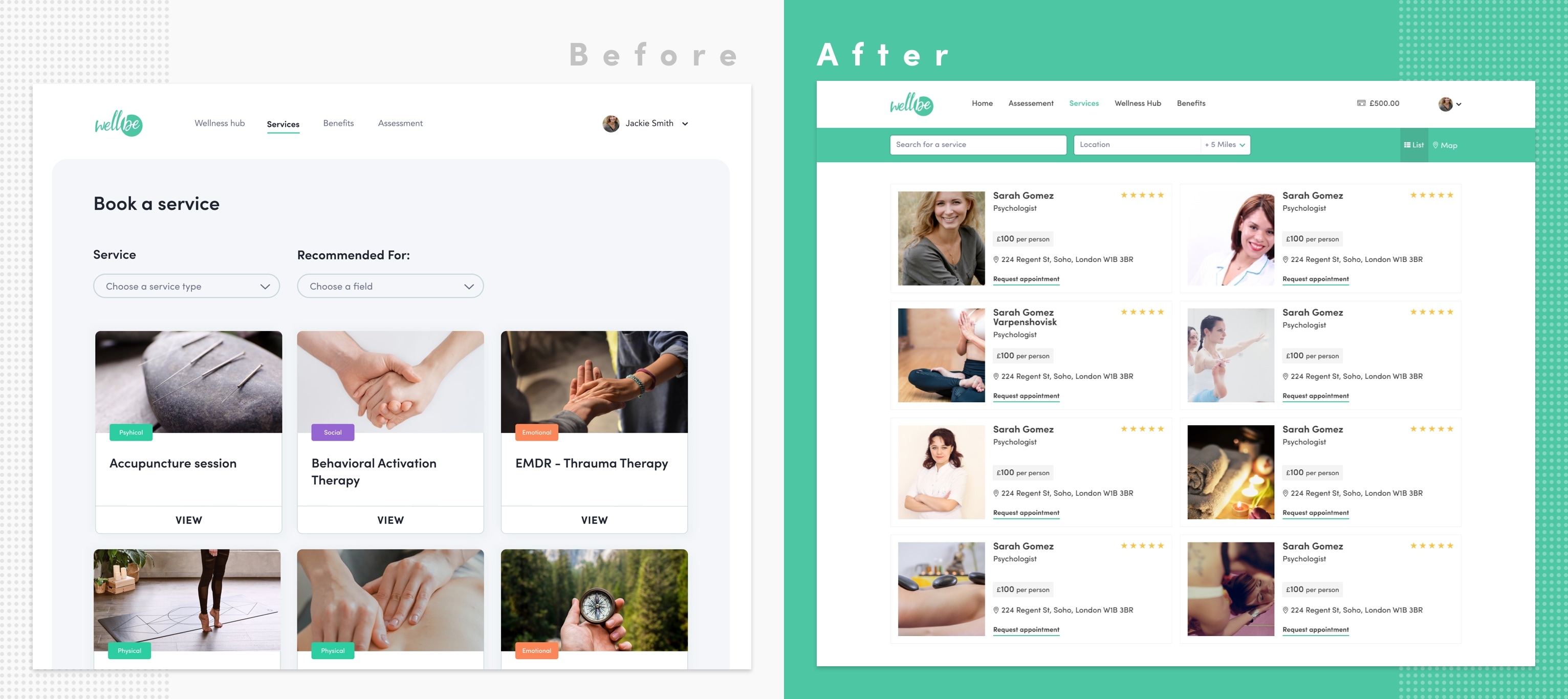
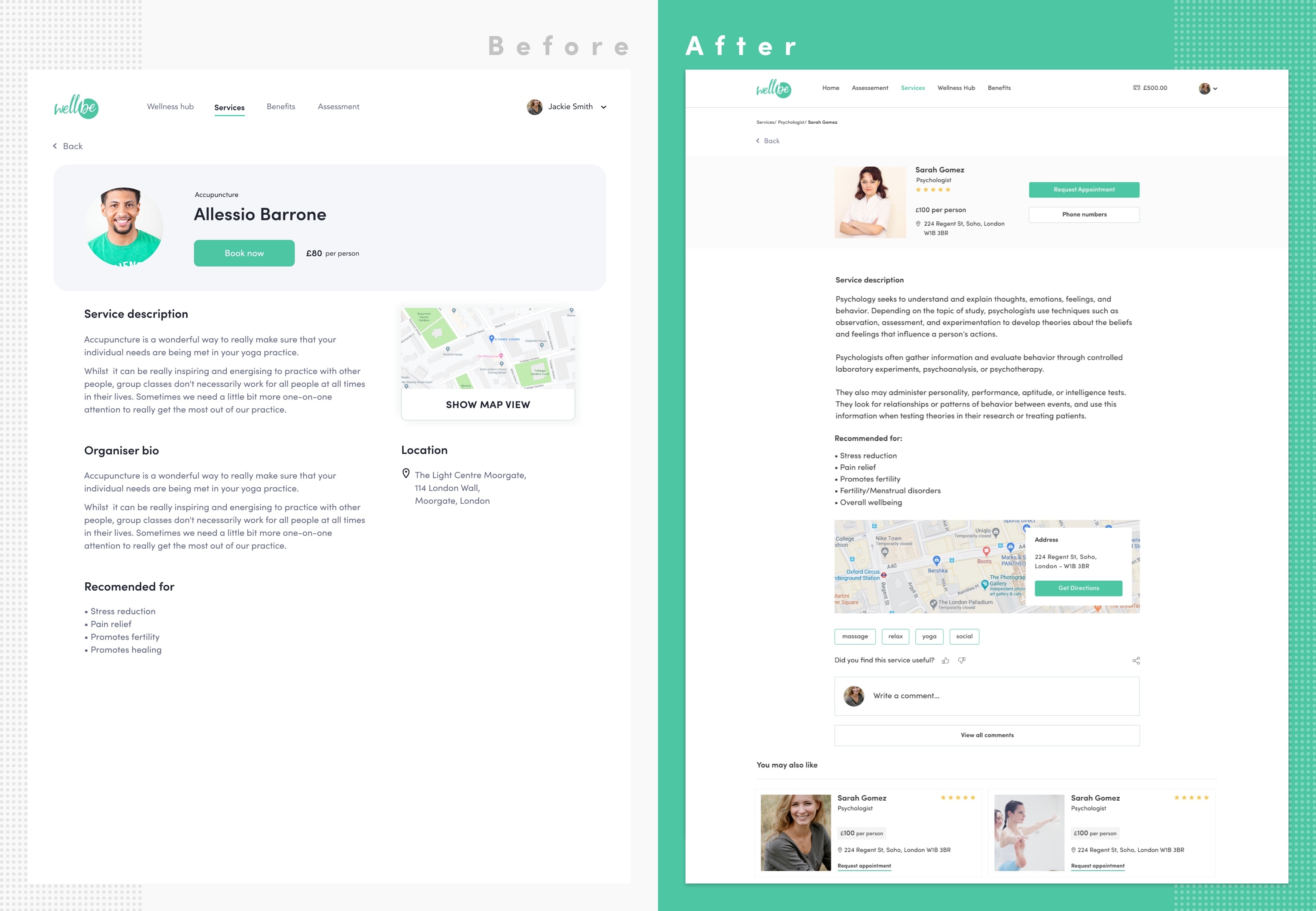
5. Service provider page
We didn't have to change too much on this page, here the users can find all the information they need before booking an appointment.
The page includes the provider's picture, name, price, address, phone numbers and information related to their business.
I made a few changes like adding the service rating and comments section and I tweaked the map view a little bit by adding the "get directions" option. At the end of this page, the users can find recommendations for related services.
Conclusion
Working at WellBe is being a great experience for me, being able to work on this product allowed me to help lots and lots of people to improve their wellbeing. I saw how much communication is important for the success of a product and I learned a lot about the wellness industry.
The biggest design challenge was to understand the user's needs and figure out how the platform could better interact with them to truly understand their needs and provide the necessary support to improve their wellbeing. I tried to overcome this challenge by pinpointing the pain points during the design process, creating online surveys, helping with the user interviews and redesigning the platform to improve the user experience.
Wanna see more?
Boots App Redesign
This was not done by the official Boots team, it is just a concept that I made up to try out what I learned at the Interaction Design Foundation.
Designing a guided AI document creation flow
A guided, AI-powered drafting experience that replaces uncertainty with clarity - improving activation, trust, and retention.